Thaldev Kaim - Work
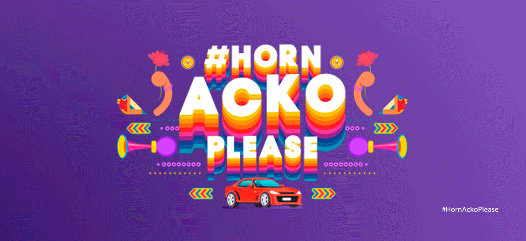
ACKO Insurance


ACKO is a digital insurance company that is changing the way people buy insurance. We designed a brand new identity for Acko that captures the app's simplicity and ease of use. The extended visual language introduces a refined color palette while adding the brand’s playful visual personality.
We worked closely on the project with Acko's founder and CEO Varun Dua and the in-house design and brand team. Acko’s brand identity was created to launch the company in 2017 with a logo that resembles a toggle or switch. The toggle is an app element in the platform, signaling the start and end of the insurance as per someone's need.
Working with the creative team at Acko we explored a wide range of possibilities for the new identity, from options that suggested connect-the-dots, complex shapes, emojis, and people-like shapes, to a system that celebrated the website’s unique visual vocabulary.
Ultimately, the team decided to select the design of categories to know as visuals representing Switch On & Off. The logo is comprised of one basic geometric shape of a toggle switch that can be extracted and used as graphic elements. The toggle evokes the idea of on and off at your comfort and will form the basis of a system of customized icons, illustrations, and motifs with rounded corners that echo the shapes of the logo. The toggle can scale up or down to optimize legibility at various sizes.
The color palette features three primary colors. These have been optimized to look better on-screen with green as an accent color.
Over the coming months, the new direction will roll out across Acko and its brand expressions, including the website, in advertising, and in other places in the app itself.